

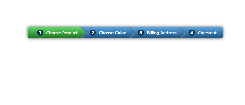
Pada tutorial kali ini, kita akan sebuah menu navigasi breadcrumb menggunakan CSS3. Hasil akhir dari menu navigasi tersebut adalah seperti gambar di bawah ini:
Lihat video cara pembuatannya berikut ini:
Source Code
<html>
<head>
    <title>Pure CSS3 Breadcrumb Navigation Menu</title>
    <style>
        /* Import custom font from google font*/
        @import url(http://fonts.googleapis.com/css?family=Noto+Serif);

        body {
            font-family: 'Noto Serif', Verdana, Arial;
            font-size:13px;
            padding-top: 100px;
            text-align:center;
        }

        .breadcrumb {
            display:inline-block;
            box-shadow: 0 0 15px 1px rgba(0,0,0,0.6);
            border-radius: 5px;

            overflow:hidden;
            counter-reset:flag;
        }

        .breadcrumb a {
            display:block;
            float:left;

            text-decoration:none;
            padding: 0 10px 0 60px;

            line-height:36px;

            background: linear-gradient(#5DA6E1,#185282);
            color:white;

            position:relative;
        }

        .breadcrumb a.active, .breadcrumb a:hover {
            background: linear-gradient(#64D86A, #1D7521);
        }

        .breadcrumb a.active:after, .breadcrumb a:hover:after {
            background: linear-gradient(135deg,#64D86A, #1D7521);
        }

        .breadcrumb a:after {
            content:'';
            width: 36px;
            height:36px;

            background:linear-gradient(135deg,#5DA6E1,#185282);

            position:absolute;
            top:0px;

            z-index:1;
            right:-18px;

            -webkit-transform: scale(0.707) rotate(45deg);
            -moz-transform: scale(0.707) rotate(45deg);
            -o-transform: scale(0.707) rotate(45deg);
            transform: scale(0.707) rotate(45deg);

            border-radius: 0 0 0 30px;

            box-shadow: 2px -2px 1px 1px rgba(0,0,0,0.5),
                3px -2px 1px 1px rgba(255,255,255,0.6);
        }

        .breadcrumb a:last-child:after {
            content:none;
        }

        .breadcrumb a:last-child {
            padding-right:20px;
            border-radius: 0 5px 5px 0;
        }

        .breadcrumb a:before {
            content:counter(flag);
            counter-increment:flag;

            width: 20px;
            height:20px;

            background:#0E2F4A;
            font-weight:bold;

            position:absolute;
            top:0px;
            left:30px;

            line-height:20px;
            margin:8px 0;

            border-radius: 100%;
        }
    </style>
</head>
<body>
<div class="breadcrumb">
	<a href="#" class="active">Choose Product</a>
	<a href="#">Choose Color</a>
	<a href="#">Billing Address</a>
	<a href="#">Checkout</a>
</div>
</body>
</html>